Website UI/UX Design
Tabstats
Project Overview
Tabstats is a website and dashboard system founded in 2019. This product was focused around a large scale website created around an API integration with “Ubisoft Connect” and the video game “Rainbow Six Siege”. The website portion was made to integrate with a downloaded dashboard application used to track player data, giving deep insights to their gameplay and how they could improve.
With new seasons being added to the game every 3 months, the product was in constant need of feature additions and adjustments as changes were made to the API. Monetization was accomplished through ad revenue and through a SaaS-based stats and anti-cheater dashboard integrated into the game.
This product had over 13 million registered profiles and over 100k daily active users across PC, mobile, Microsoft Xbox and Sony PlayStation.
Project Timeline
July 2022 - Feb 2023
My role
Worked closely with Ubisoft & Battleye to acquire assets, implement new changes/updates and more. As well as leading the creation of a dashboard system used to enhance gameplay for users. This was an extremely user experience-dependent product with a large number of users depending on the website & dashboard daily.
This project was seen as a leader for cheater detection and the go to statistics/leaderboard website.

Goals
Website Upkeep
Upkeep on the website to adjust to changes that were made to the API as well as new seasonal additions/changes
Feature Additions
New feature addition planning and buildouts to keep the product fresh and stay ahead of the competition
User Experience
Constant user feedback adjustments and QoL changes
User Research + Data Analysis
As always, user research and feedback was a driving force behind decisions on the product. Feedback was collected from multiple channels including feedback through our website, discord and reddit communities.
A majority of additional features added to the product were due to discovery through countless hours of the QA team surfacing user issues and needs, passing them off to myself and another designer which gave us a solid starting point to conduct user interviews.
Multiple rounds of user interviews were conducted every other month and before a major release to ensure the product was always meeting the needs of users.
Design System
An incredibly robust design system was made for this project with component sets corresponding to every season of Rainbow Six Siege matching it’s theme and assets.


Sitemap
The full sitemap included over 50+ pages as well as social login system integrated into Faceit (esports platform) and sold as a separate product.
Full Page Breakdown
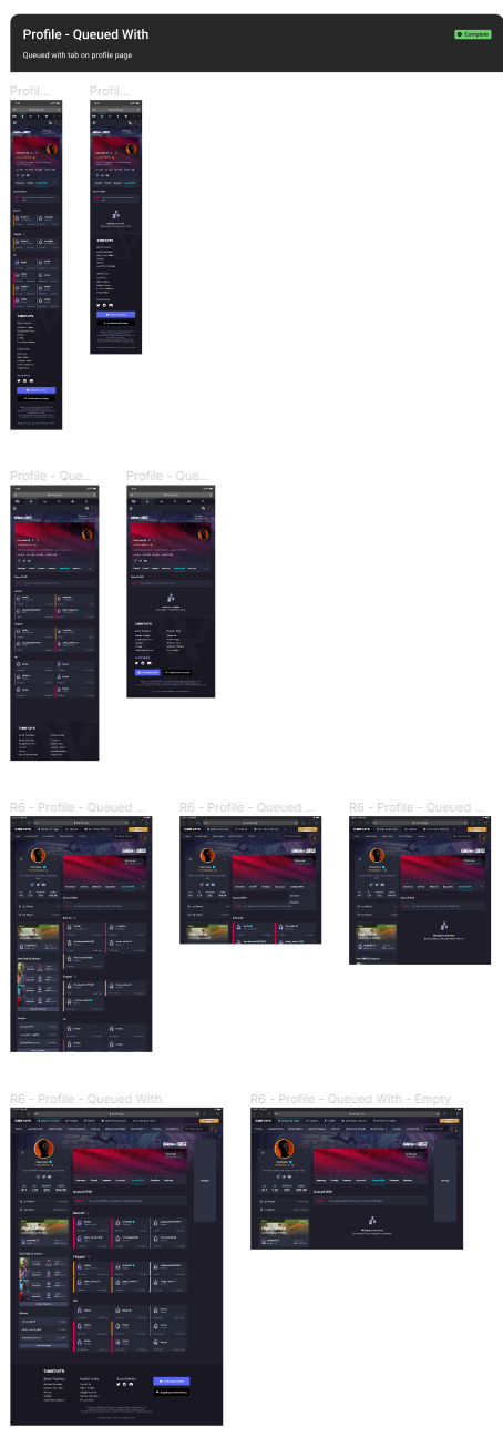
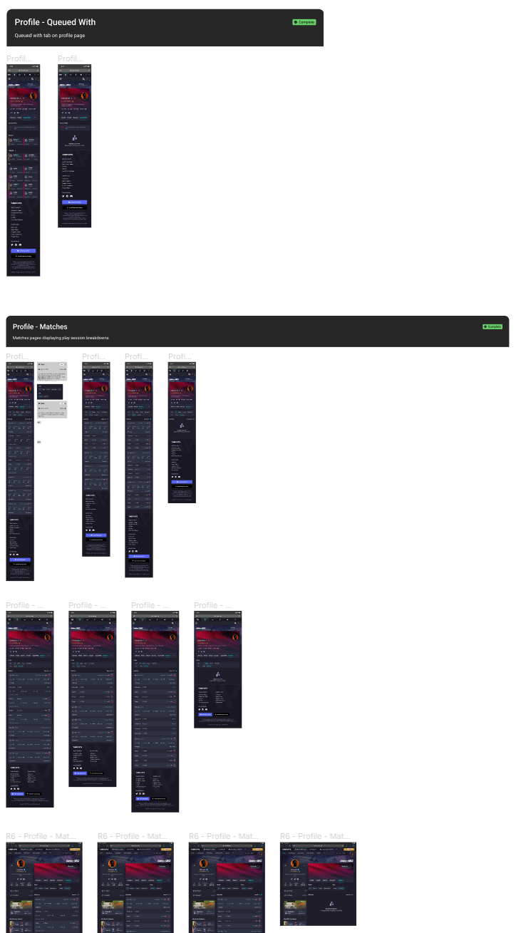
The below screenshots are a brief look into some of the Figma files and the scale of the project.


