
Steam Mobile Redesign Concept
Case Study
Project Overview
Steam is a video game digital distribution service and storefront by Valve. It was launched as a standalone software client in September 2003 as a way for Valve to provide automatic updates for their games, and expanded to distributing and offering third-party game publishers' titles.
Steam is the world’s largest distributor of PC games, taking up 75% of the global market share. Steam mobile was created nearly four years ago and its last update happened over two years ago making the app feel extremely outdated and abandoned.
Project Timeline
October 2021 to February 2022
My role
Conducting interviews, paper and digital wireframing, low and high-fidelity prototyping, conducting usability studies, accounting for accessibility, and iterating on designs.

Problem Statement
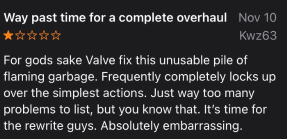
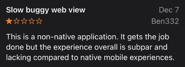
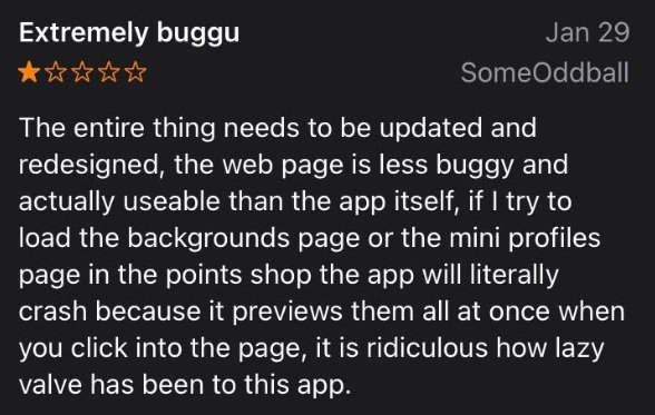
The reviews on the app store speak volumes with 10,257 ratings averaging a 2.6 out of 5.
The Goal
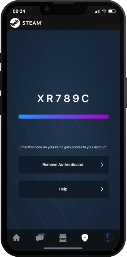
Make a mobile app that feels native but also preserves the feel and familiarity of steam on desktop while giving users a large majority of the features they’re used to having access to.
Review Insights
To start I went through all ten thousand reviews and created affinity maps to help identify themes that pinpoint common pain points:
Outdated design
Doesn’t feel native
Clunky feel overall
Hard to navigate
Many features hard to reach or find
Finding games in the store is overly complicated
Countless issues with the store
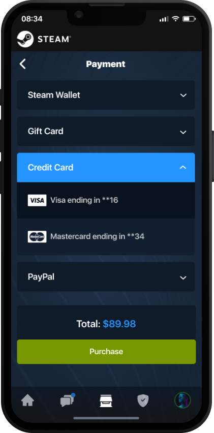
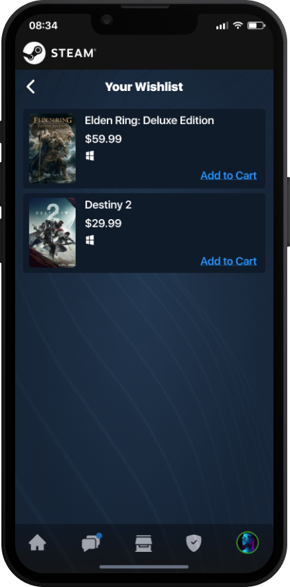
Difficult to navigate, too many steps to purchase, can’t find wishlist
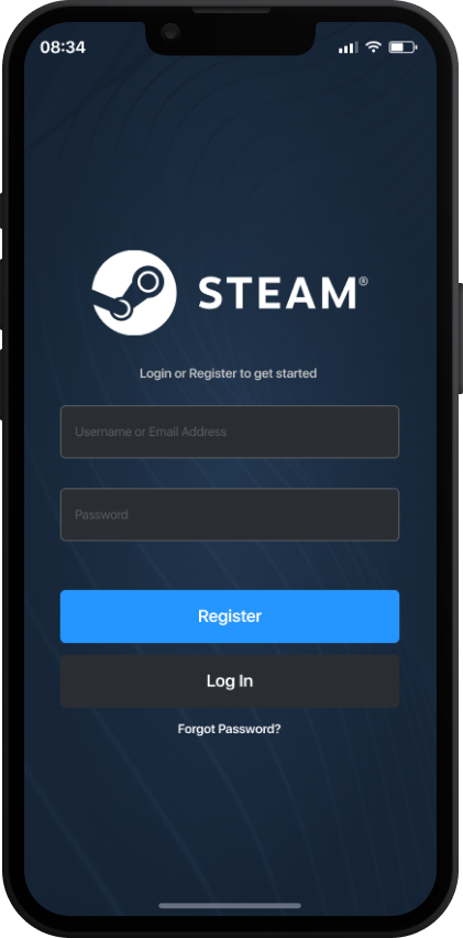
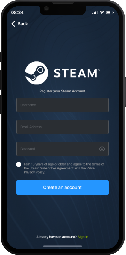
Extremely hard to log in
Due to an overcomplicated login process


User Research: Interviews
With COVID making in-person user interviews near impossible, I had the idea to test the ability to conduct the interviews on my Meta Quest 2. This research was done in a specific way so I suggest checking out my full breakdown on this method on medium. To give a brief synopsis, VRchat was utilized as well as a world called “No Time Two Talk” where you’re matched with people based on a few checkboxes you selected to mark your interests. The world then matches you with people who chose similar categories. This made finding participants for my study much easier. People were surprisingly open to answering questions and having the ability to not only hear the inflection in their voice but also see their body movements like hand gestures made it much easier to determine how strongly a person felt about a particular question. After two quick pre-qualifier questions, I ended up conducting a total of 30 interviews.
Each person interviewed answered yes to the following two questions before being asked to do the interview:
Are you a PC gamer?
Are you a Steam user?
I then proceeded to ask the following questions:
How often do you use Steam?
What features do you use most often on Steam desktop?
Where do you normally buy PC games?
What makes you choose Steam?
Do you have the Steam mobile app on your phone?
What features would you want to see in a Steam mobile app?
As of January 2021, 25.92% of gamers on Steam have Facebook’s Oculus Rift S headset, followed by Oculus Quest (16.48%), HTC Vive (16.27%), Valve Index HMD (16.13%), and Oculus Rift (9.31%) (Steam, 2021)
Interview Findings
What makes you choose Steam?
“Most games are on there”
“Almost all of my friends use it so I can play with them”
“They normally have the best sales”
What features do you use most often on Steam desktop?
Buying Games
Playing Games
Chatting/Inviting & Playing with Friends
What features would you want to see in a Steam mobile app?
Ability to buy games
Ability to update games or see downloads
Ability to chat with friends or see what they’re playing
Do you have the Steam mobile app on your phone?
100% of participants answered No
How often do you use Steam?
Where do you normally buy PC games?
Information Architecture
I took into consideration the user feedback from the initial interviews and the reviews on the current app when structuring the apps architecture.
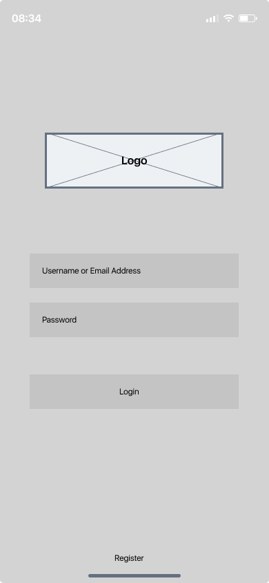
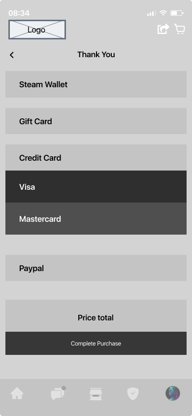
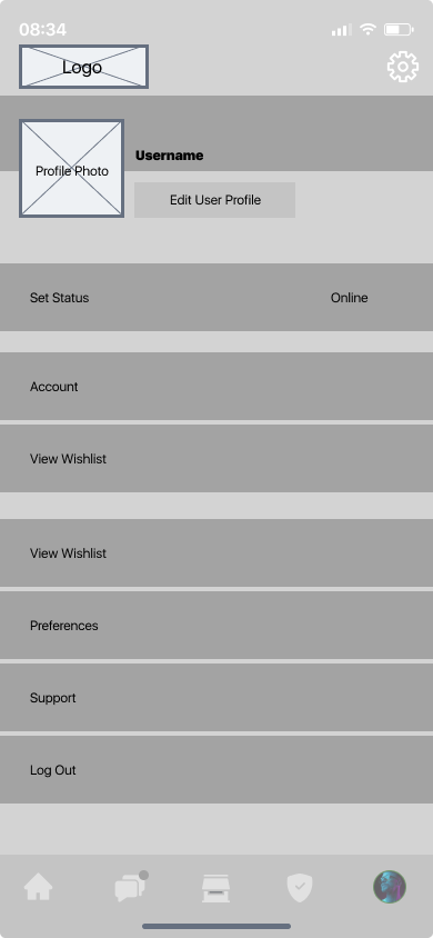
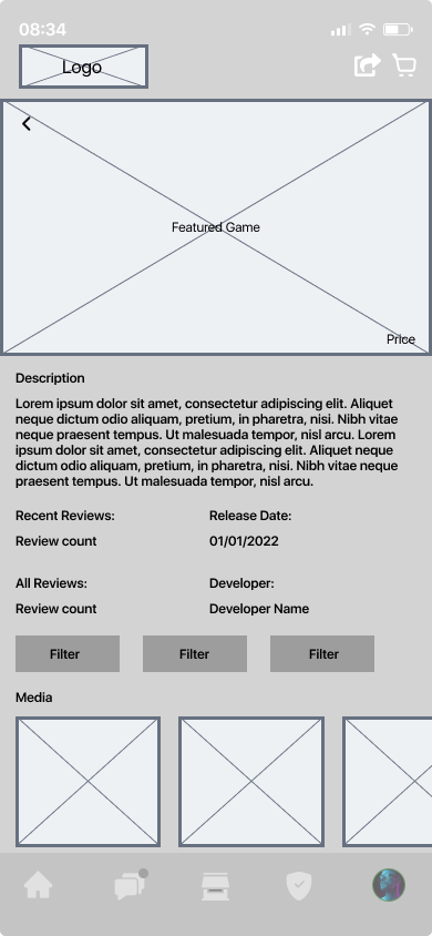
Digital Wireframes & Low-Fidelity Prototype
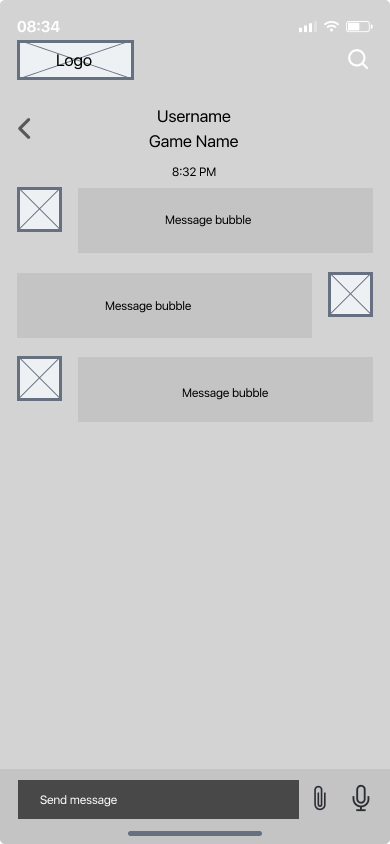
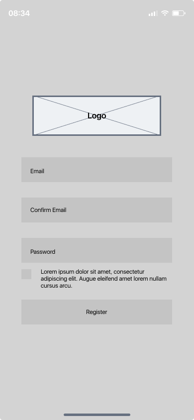
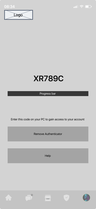
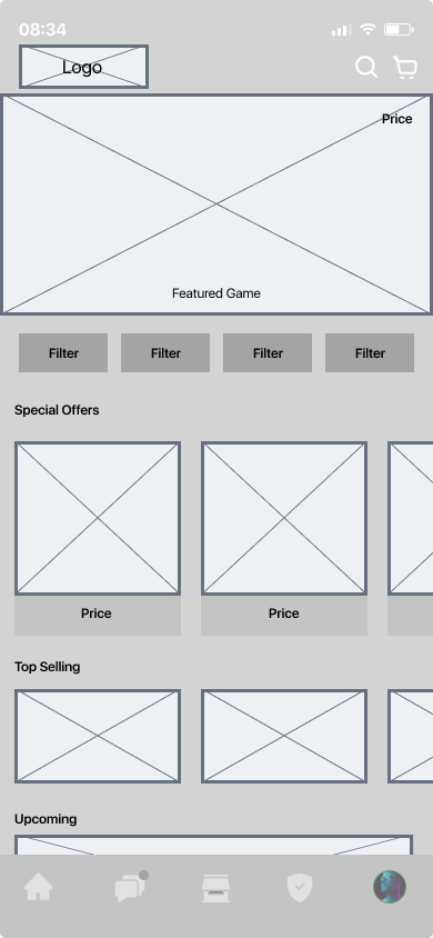
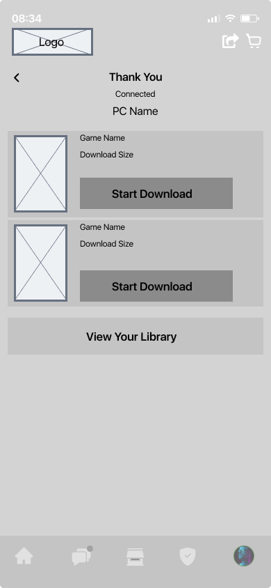
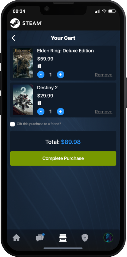
Using the completed set of digital wireframes, I created a low-fidelity prototype. The prototype details the main user flows including finding, purchasing and downloading a game.

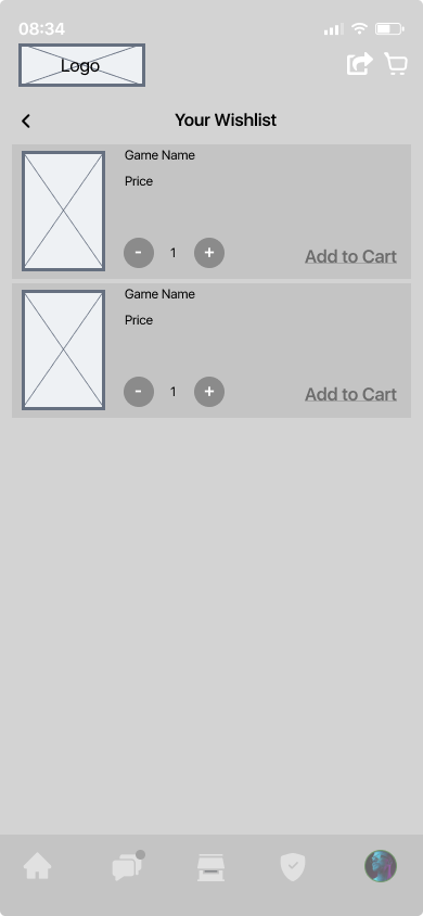
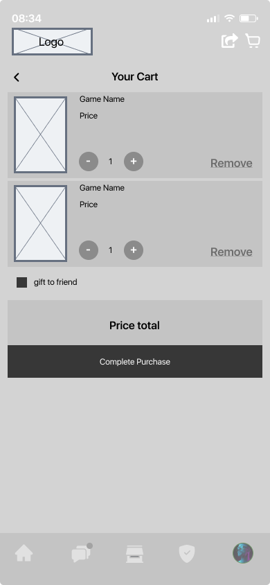
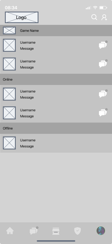
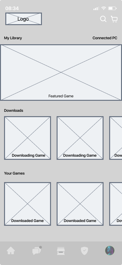

Usability Testing Findings
Users were asked to explore the app’s lo-fidelity prototype as if they were purchasing a game, start a conversation with a friend, and view their library to start a patch on a game.
These were the main findings uncovered by the lo-fidelity usability study.
Round 1 findings
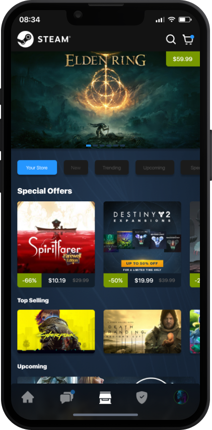
Users want to see clear indicators for games on sale and the price of the game before the sale
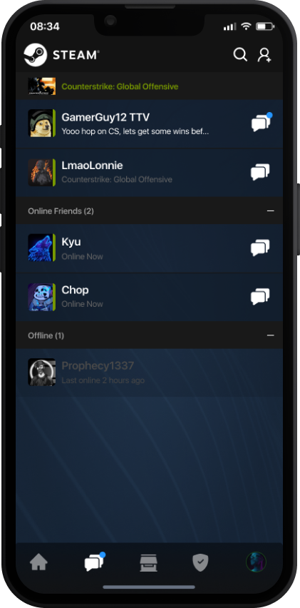
Users want to see a preview of the message a friend is sending as well as a global indicator of when they receive a message
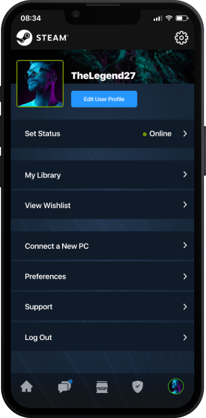
Users would like to see a more significant portion of their profile on the mobile profile page similar to desktop
Mockups
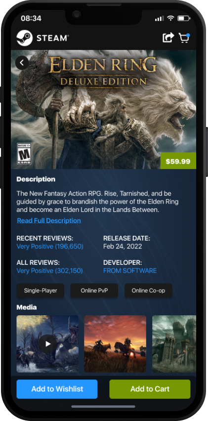
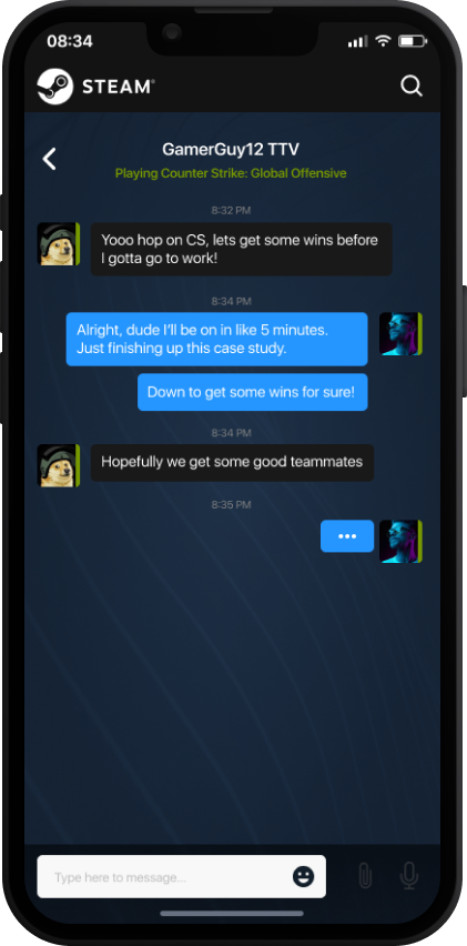
Based on insights from the usability studies, there were a large number of tweaks done to the UI.
Some significant takeaways were changes like a clear indicator on what items are on sale, sale amount and original pricing. The friend’s page was also revamped to include a cleaner way to see who messaged you, a preview of the message and when a new message has been delivered.
High-fidelity Prototype
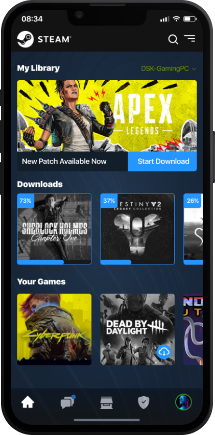
The high-fidelity prototype cleaned up a lot of the user flows and implemented a significant amount of feedback from testing round one. The high-fidelity prototype was then ran through a second usability test. This test helped unveil some finer details on how the user flow could be improved and even more modifications to the UI.

Usability Test Findings
Users were asked to perform the same tasks from the previous usability test: explore the app as if they were purchasing a game, start a conversation with a friend and viewing their library to start a patch on a game.
These were the main findings uncovered by the high fidelity mockup usability study.
Round 2 findings
Users want to be able to quickly add games to their wishlist on the games store page
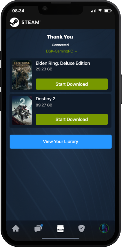
Users want to see the current download status of updates as well as games on their connected PC
Users would like the ability to select their PC connection from the thank you page to begin the download of the purchased game quickly
Accessibility Considerations
As with all projects that I work on, I make sure to follow the three principles below.
Followed WCAG guidelines to help provide access to users who are visually impaired through adding alt text to images for screen readers and more.
Many design considerations were taken into account for not only usability but also accessibility. All touch points were made with a minimum of 40px in height and width. All text is 11pt or higher.
Kept information consistent throughout each screen and allowed the text to breathe with spacing between each row for quick readability and programmatically processing.

Takeaways
The overall experience from start to finish demonstrated that having a Steam mobile app is not only possible but a very big missed opportunity to keep users always connected to the platform. Keeping users connected to the platform can help increase game sales and preserve market share as users are able to access Steam on the go.
Next Steps
Conduct further research after viewing the data surrounding the apps usage to continue to improve user flow.
Test additional features like the addition of trading and community forums.
Build out the profile section of the app to be even closer to the desktop version.
Explore VR interviews deeper in the metaverse specifically using Facebook’s Horizon Worlds app.


